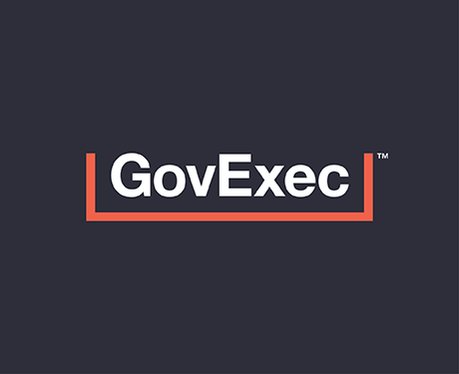
In May, GovExec launched a refreshed brand identity that not only captured GovExec’s vision for the future, but was flexible enough to fit its expanding portfolio and multi-pronged solutions for government contractors. Katie Connelly, Creative Director at GovExec, shared the story behind the development of the new look and feel.
What were you hoping to accomplish with the new GovExec brand identity?
Over the past year, GovExec has experienced explosive growth. As we began to grow and acquire these new entities, it quickly became clear that we lacked a strong, cohesive visual direction. Aside from a row of our logos, there were very few elements that articulated our mission and our sub-brands effectively.
In creating this new brand identity, the number one goal was to produce a full bodied, thoughtful, dynamic, and modern set of deliverables that underpin GovExec’s mission and build upon the equity we’ve built already in the market. This new brand identity cements our presence in the public sector market even further. Some of my favorite elements to highlight are the new GovExec logo as well as the introduction of our signature iconography in combination with motion and kinetic type.
It was also extremely important to build an identity that our internal teams and stakeholders felt connected to and believed in. Our mission remains with government leaders, but I wanted to ensure that each and every individual at GovExec was given an opportunity to see themselves in the new brand identity. In doing so, we were able to access an overwhelming feeling of excitement and empowerment at the individual, team and organizational level… something that has been really powerful to watch unfold as this new identity is introduced to the world.
What were the biggest challenges in developing a new brand identity?
It was a fun challenge to develop an identity that represented all of our sub-brands without it leaning too far into any one particular look and feel. Government Executive, Nextgov, Defense One, Route Fifty, The Atlas for Cities, City & State, Military Periscope, GCI, and Government Marketing University all have their very own distinct identities, so it was important to ensure that GovExec remained neutral amongst those.
Throughout our exploration, it remained a priority to marry our legacy and our future in a visually clever way. Our story isn’t new, there is already over 50 years of work behind us, so the key challenge was to figure out how to create an identity that nodded to our legacy in government but also crystallizes our future and the road ahead.
Our new color scheme and type system are both great examples of how we leaned into this idea of new and old within the identity. ‘Slate,’ the coined nickname for the navy blue color in our palette, is more traditional, stable, and strong, while ‘Glo,’ the nickname for the fluorescent orange, is the more dynamic, bold, and modern of the two primary colors. We also introduced two new typefaces. Our primary typeface, the iconic and timeless Helvetica Neue Bold, signals authority and permanence. Our secondary typeface, GT America Mono, was chosen for its distinctive monospace features and usage for source code.
What are the keys for making a brand identity stick with key stakeholders over time?
I would say that it boils down to three main elements:
Dynamic visual elements:
A brand goes so far beyond a wordmark or shape—that’s just one piece of the puzzle. You want to make sure you’re creating a variety of dynamic, visual elements to support your brand. Those elements can include iconography, imagery, typography, motion, color, etc. The primary goal is to keep your audience engaged with your content while establishing brand familiarity. Make sure that what you are producing is consistent and cohesive but also new, fresh, and exciting to keep your viewers always wanting more.
Brand familiarity:
Get out of the mindset that brand identities are just one-off projects that have a start date and an end date. Brand identities aren’t just a simple project or a market moment, they are meant to be embodied into every facet of your organization. The key to making a brand “stick” is to ensure the promotion of a steady, strategic, and divisive cadence of materials across your entire portfolio. How these materials are branded also matters. Be sure you are developing a clear set of rules or guidelines to keep collateral as consistent as possible.
Empowerment and connection:
It’s important to realize that your brand does not live in a bubble. How audiences and stakeholders perceive and interpret your brand is the real big mystery. It’s essential that you are creating an opportunity for your audience to connect to your brand and allow them to feel empowered and excited to share and promote the brand through their own unique lens.


